
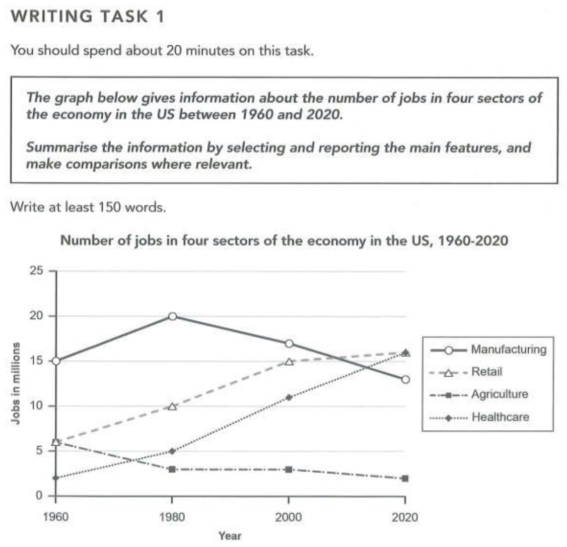
The line graph illustrates the number of jobs in four distinct sectors of the American economy from 1960 to 2020. Overall, manufacturing remained the sector with the highest number of jobs for most of the period, though it was eventually overtaken by retail and healthcare by 2020. Additionally, while manufacturing and agriculture showed an overall decline, retail and healthcare followed a consistent upward trajectory throughout the timeframe. Regarding sectors with downward trends, in 1960, the number of jobs in manufacturing stood at 15 million. This figure then steadily increased, reaching a peak of around 20 million in 1980, before gradually falling to approximately 13 million by 2020. Agriculture, meanwhile, witnessed a continuous downward trend, with the figure decreasing from 5 million to merely 2 million over the same period. By contrast, healthcare recorded a substantial rise in the quantity of jobs. Starting at only 2 million in 1960, the figure then dramatically climbed to roughly 16 million by 2020. Following the same pattern, the figure for retail rose from just over 5 million in 1960 to about 16 million in 2020, on par with that of healthcare. Notably, by the end of the period, retail and healthcare had surpassed manufacturing, becoming the two largest providers of jobs.
নমুনা বিস্তারিত
The graph below gives information about the number of jobs in four sectors of the economy in the US between 1960 and 2020
21/07/2026 18:10 8.0 স্কোর
টপিক বা বিষয়
The graph below gives information about the number of jobs in four sectors of the economy in the US between 1960 and 2020
শব্দ সংখ্যা: 207
চার্ট/গ্রাফ
Essay
সামগ্রিক স্কোর
8.0±0.5
চমৎকার
রাইটিং মানদণ্ড স্কোর
TA8.0
CC8.0
LR8.0
GRA8.0
উন্নতির জন্য বিস্তারিত পরামর্শ দেখতে প্রবন্ধের হাইলাইট করা যেকোনো লেখায় ক্লিক করুন।
গভীর বিশ্লেষণ
Task 1 - Academic Writing
4 tools available
নমুনা রচনা - IELTS Writing Task 1
কোনো নমুনা রচনা নেই
টাস্ক ১-এর জন্য উচ্চমানের নমুনা রচনা বিশ্লেষণ এবং তৈরি করতে নিচের বাটনে ক্লিক করুন।