
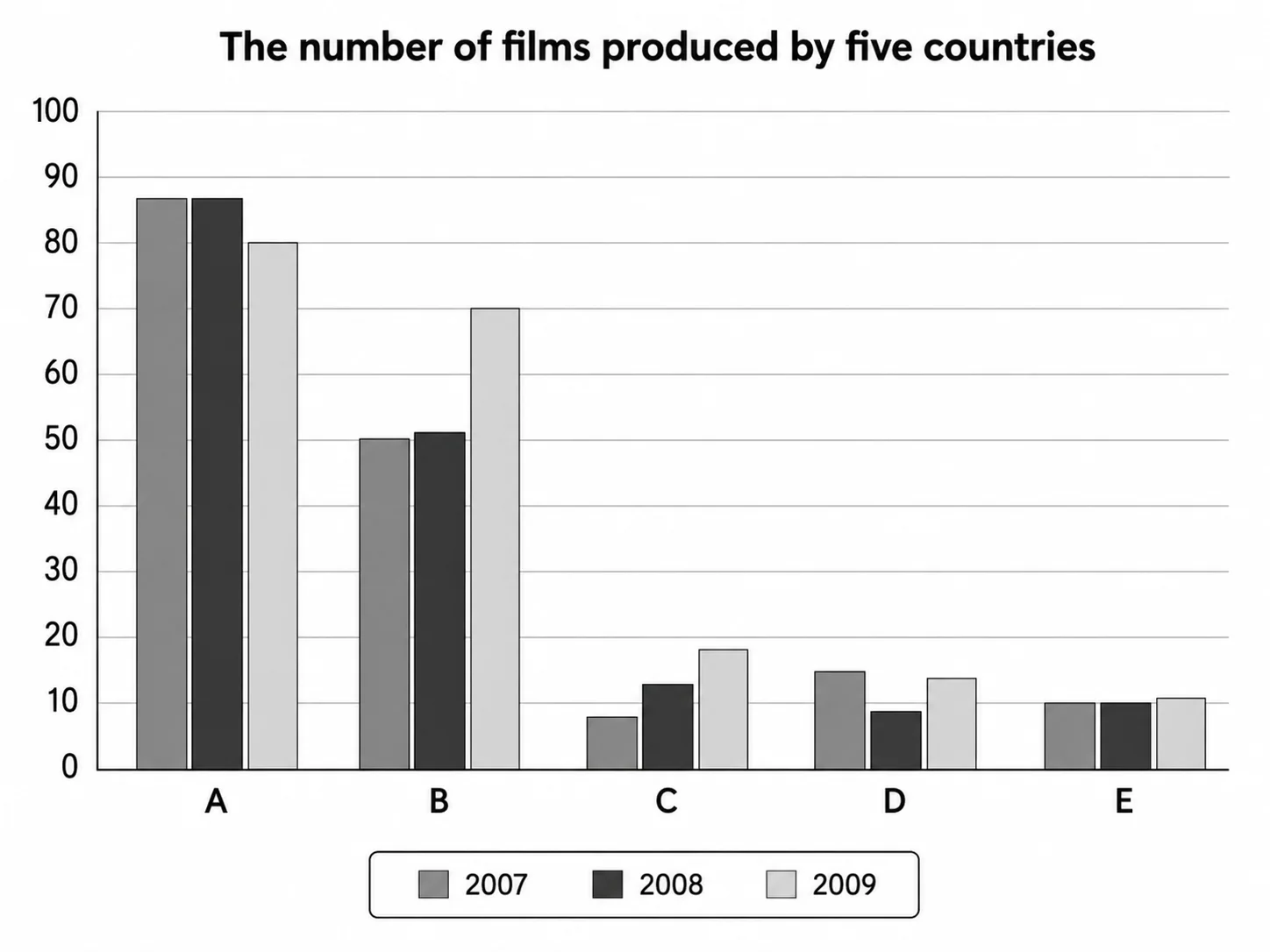
The bar chart compares the number of films produced by five countries between 2007 and 2009. Overall, countries A and B were the largest film producers throughout the period, whereas countries C, D and E produced considerably fewer films. Most countries experienced an increase in film production by 2009, with the exception of country A, which saw a slight decline. In 2007, country A produced approximately 87 films, compared with around 50 in country B. These figures remained almost unchanged in 2008. Meanwhile, country C experienced a slight increase from about 8 to 12 films, whereas production in country D fell from roughly 15 to 9 films. Country E remained stable at around 10 films. By 2009, film production in country A had fallen slightly to around 80 films, although it still recorded the highest figure. Country B experienced the largest increase, rising to approximately 70 films. The numbers for countries C, D and E also increased, reaching about 18, 13 and 11 films respectively.
รายละเอียดตัวอย่าง
The graph below illustrates the number of films produced by five different countries over three years. Provide an overview of the information by identifying and describing the key details, and include comparisons where appropriate.
21/07/2026 19:11 7.0 คะแนน
หัวข้อ
The graph below illustrates the number of films produced by five different countries over three years. Provide an overview of the information by identifying and describing the key details, and include comparisons where appropriate.
จำนวนคำ: 165
แผนภูมิ/กราฟ
Essay
คะแนนรวม
7.0±0.5
ดีมาก
คะแนนเกณฑ์การเขียน
TA7.0
CC7.0
LR7.0
GRA7.0
คลิกข้อความที่ไฮไลต์ในเรียงความเพื่อดูคำแนะนำรายละเอียดเพื่อพัฒนา
การวิเคราะห์เชิงลึก
Task 1 - Academic Writing
4 tools available
บทความตัวอย่าง - IELTS Writing Task 1
ยังไม่มีบทความตัวอย่าง
กดปุ่มด้านล่างเพื่อวิเคราะห์และสร้างบทความตัวอย่างคุณภาพสูงสำหรับ Task 1