
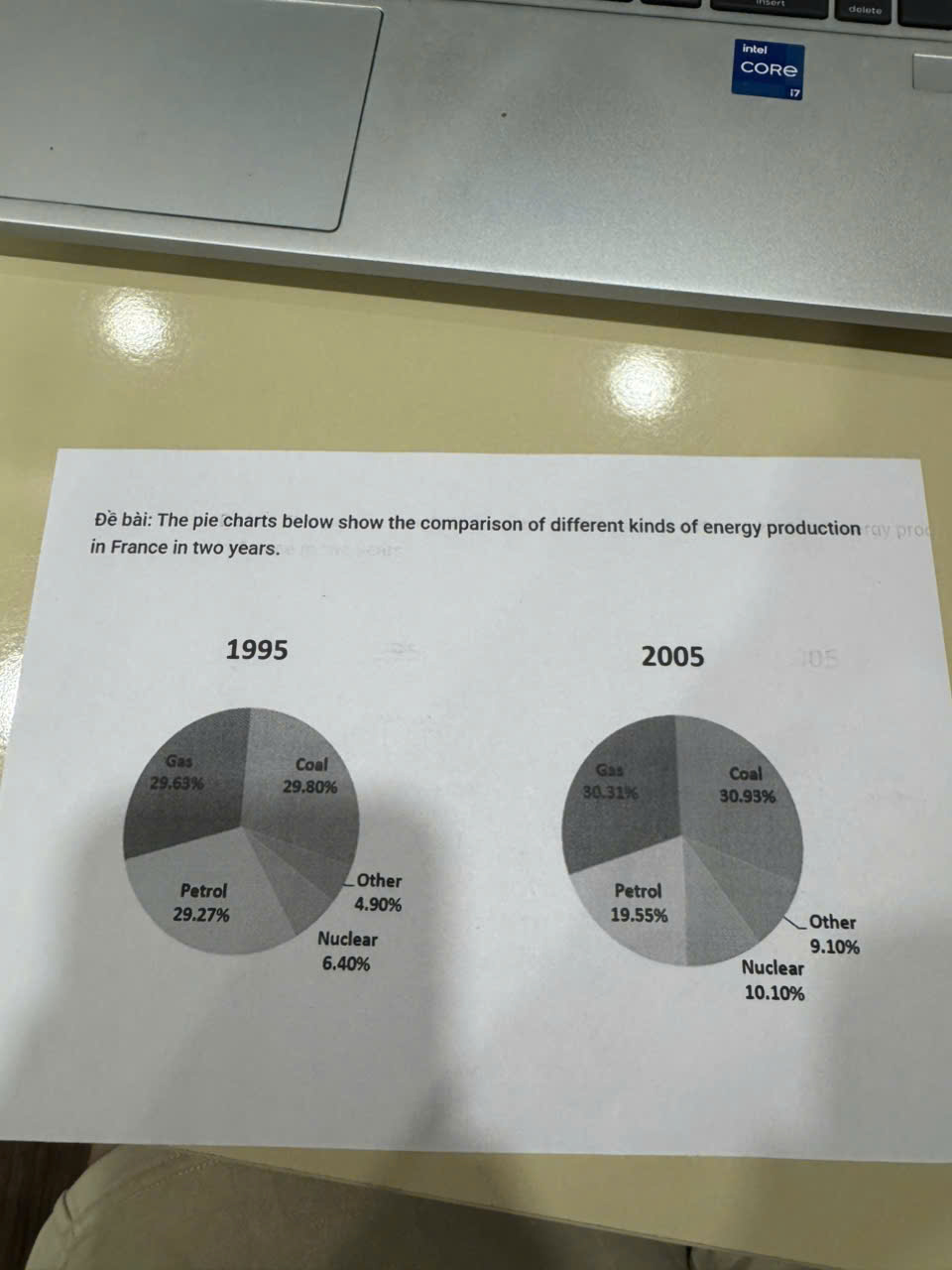
This graphs illustrate the difference of many types of energy production in France between 1995 and 2005. In overview, the both pie charts had percentages of coal really high, always at the top and the lowest was other. Moreover, from 1995 and 2005 had 5 types of energy with all of them changed the quantities. First, coal is the highest kind of energy production in both two years 1995 and 2005, about nearly 30% and 31% respectively. Not at all, the other types of energy kept into the lowest seat, but it increased highly from 1995 to 2005, about 4,9% went up to 9,1%. Second, although petrol became the third prize in 2 years, this energy decreased sharply in 10 years with 29,27% in 1995 and 19,55% in 2005. In comparison, gas also increased from 1995 to 2005 in France like coal, this energydid not go up very much, about 29,63% and 30,31% respectively, just a little bit of changing.
Sample Detail
The pie charts below show the comparison of different kinds of energy production in France in two years.
21/07/2026 19:25 5.5 points
Topic
The pie charts below show the comparison of different kinds of energy production in France in two years.
Word count: 160
Chart/Graph
Essay
Overall Scores
5.5±0.5
Basic
Writing Criteria Scores
TA6.0
CC6.0
LR5.0
GRA6.0
Click on any highlighted text in the essay to view detailed suggestions for improvement.
Deep Analysis
Task 1 - Academic Writing
4 tools available
Sample Essay - IELTS Writing Task 1
No sample essay
Click the button below to analyze and generate a high-quality sample essay for Task 1.