
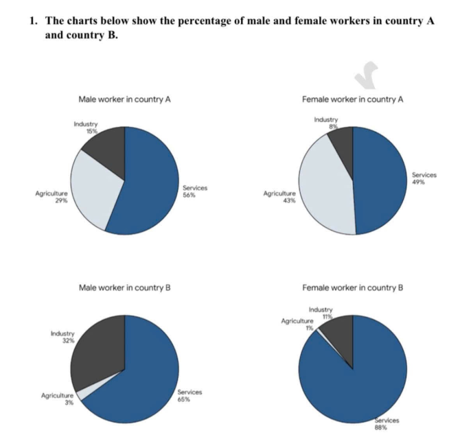
The given graphs illustrate the proportion of two genders in work in three sectors between country A and country B. In general, it is clear that services was the most prevalent choice in both countries, whereas industry and agriculture were less prevalent. In addition, country A dominated country B in terms of agriculture and the proportion male workforce was higher than females in industry. Looking first at country A, services ranked first with the figure for males and females registering 56% and 49% respectively. Services were followed by agriculture, with the figure for women made up 43%, far exceeding the 29% recorded for men. And the percentage of industry in men and the opposite sex was lowest, with 15% and 8% respectively. Turning to country B, the proportion of services was dominant, with the figure recorded 65%(males) and 88% (females). The category of industry was the next most prevalent economic sector, at 32% (men) and 11% (women). Eventually, agriculture made up the minority of the economy of country B, just only 3% for males and 1% for females.
Sample Detail
The charts below show the percentage of male and female workers in country A and country B
21/07/2026 21:02 7.0 points
Topic
The charts below show the percentage of male and female workers in country A and country B
Word count: 178
Chart/Graph
Essay
Overall Scores
7.0±0.5
Good
Writing Criteria Scores
TA7.0
CC7.0
LR7.0
GRA7.0
Click on any highlighted text in the essay to view detailed suggestions for improvement.
Deep Analysis
Task 1 - Academic Writing
4 tools available
Sample Essay - IELTS Writing Task 1
No sample essay
Click the button below to analyze and generate a high-quality sample essay for Task 1.