
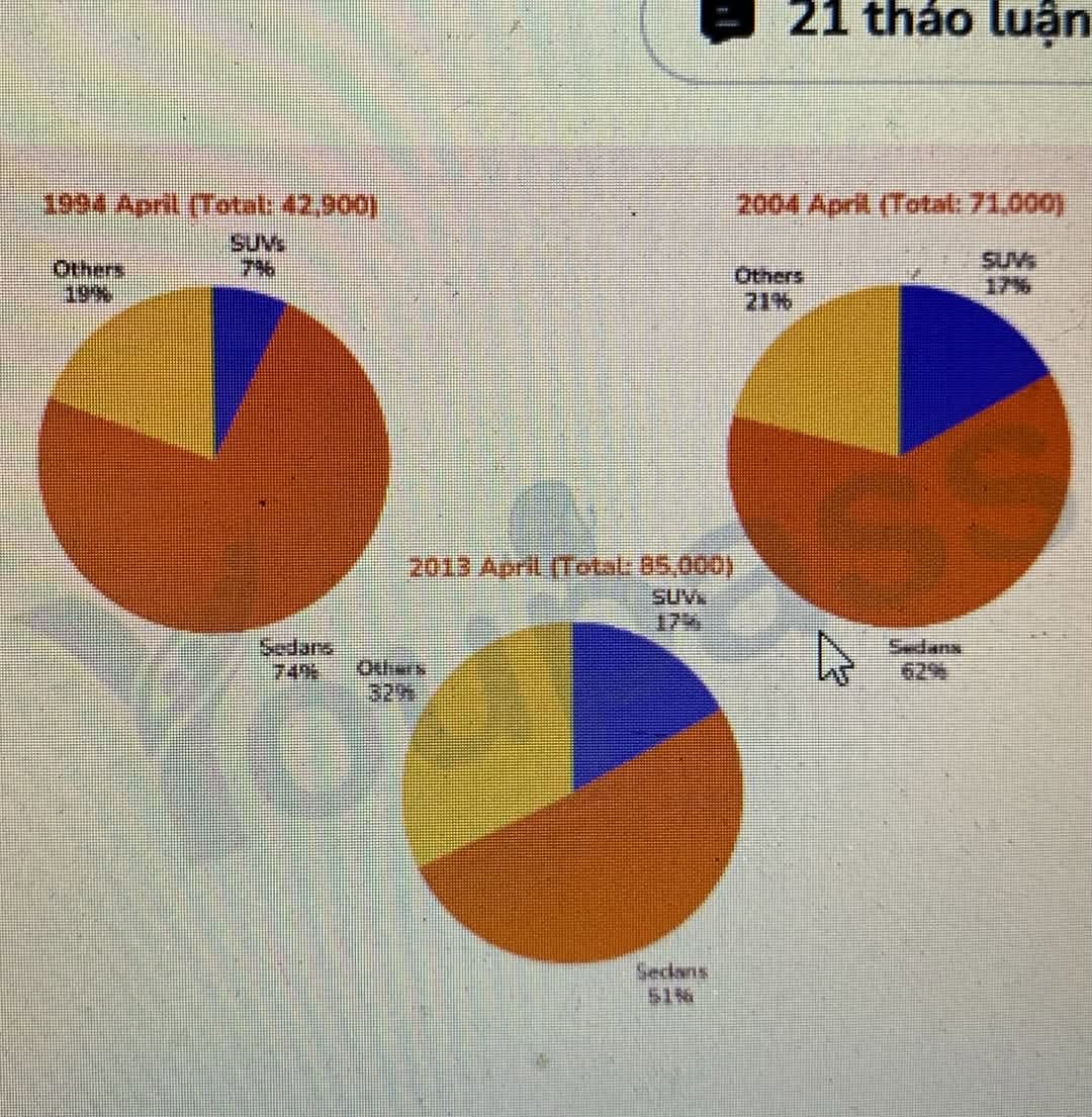
The pie charts compare the volume of new cars sold in Australia from 1994 to 2013. What is most striking when looking at the chart is that Sadans witnessed an decrease consistanly, while both SUVs and Others increased throughout the period examined. It is also important to note that Sedans always the most popular type car in all three years. Looking first at Sedans, starting the period at 74%, accounting for nearly three-quarters of the total new car sales, equal about 31,700 cars. Then it exhibited a significant fall to 62% in 2004 and keep dropping, declining to just over half the total,at 51% in 2013. Turning to vehicles had increase trend, SUVs experienced only 7% and Others had 19% in the first of the period. A notable pattern was that SUVs climbed more double in the first decade, dramatically grew from 7% to 17% in 2004. However, it remained unchanged in the subsequent nine years. Others revealed a more slightly trend to 21% in 2004, before it more significantly rose to 32% in the end of the period.
รายละเอียดตัวอย่าง
The pie charts show the sales of new cars in Australia in 1994, 2004, and 2013. Summarize the information by selecting and reporting the main points and make comparisons where relevant.
22/07/2026 00:23 5.5 คะแนน
หัวข้อ
The pie charts show the sales of new cars in Australia in 1994, 2004, and 2013. Summarize the information by selecting and reporting the main points and make comparisons where relevant.
จำนวนคำ: 179
แผนภูมิ/กราฟ
Essay
คะแนนรวม
5.5±0.5
พื้นฐาน
คะแนนเกณฑ์การเขียน
TA6.0
CC6.0
LR5.0
GRA6.0
คลิกข้อความที่ไฮไลต์ในเรียงความเพื่อดูคำแนะนำรายละเอียดเพื่อพัฒนา
การวิเคราะห์เชิงลึก
Task 1 - Academic Writing
4 tools available
บทความตัวอย่าง - IELTS Writing Task 1
ยังไม่มีบทความตัวอย่าง
กดปุ่มด้านล่างเพื่อวิเคราะห์และสร้างบทความตัวอย่างคุณภาพสูงสำหรับ Task 1