
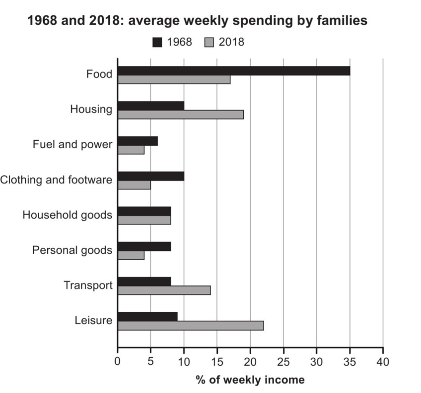
The bar chart demonstrates the average families weekly spending in one nation in two years 1968 and 2018. Overall, it is evident that the expenditure on essential categories as food dropped significantly while housing and leisure saw a substantial rise. Remarkably, other sections experienced a minimal changes over the 50-year period. In 1968, the food categories was the largest expenditure, making up 35% of total.However, this proportion had reduced in2018 by more than half to approximately 17%. In contrast, the categories of leisure saw an improvement, beginning at 9% in 1968 and increased quickly to become the dominant expense in 2018, about 2%.In the same way, housing and transport nearly doubled from 10% to 19% and 8% to 14, stimuneously. Looking at the remaining categories, expenditure on clothing and footwear had halved form 10% to 5%. the percentage of fuel and power and personal goods similarly reached at 4% in 2018. Distinguised form all the aforemention categories, the figure of weekly income on household good remained unchanged which was 8% for both years.
Detail Sampel
The chart below gives information about how families in one country spent their weekly income in 1968 and in 2018. Summarise the information by selecting and reporting the main features, and make comparisons where relevant.
22/07/2026 02:42 6.0 skor
Topik
The chart below gives information about how families in one country spent their weekly income in 1968 and in 2018. Summarise the information by selecting and reporting the main features, and make comparisons where relevant.
Jumlah kata: 173
Grafik/Diagram
Essay
Skor Keseluruhan
6.0±0.5
Cukup
Skor Kriteria Writing
TA6.0
CC7.0
LR6.0
GRA6.0
Klik teks yang ditandai di esai untuk melihat saran detail untuk peningkatan.
Analisis mendalam
Task 1 - Academic Writing
4 tools available
Esai contoh - IELTS Writing Task 1
Belum ada esai contoh
Silakan klik tombol di bawah untuk menganalisis dan membuat esai contoh berkualitas tinggi untuk Task 1.