
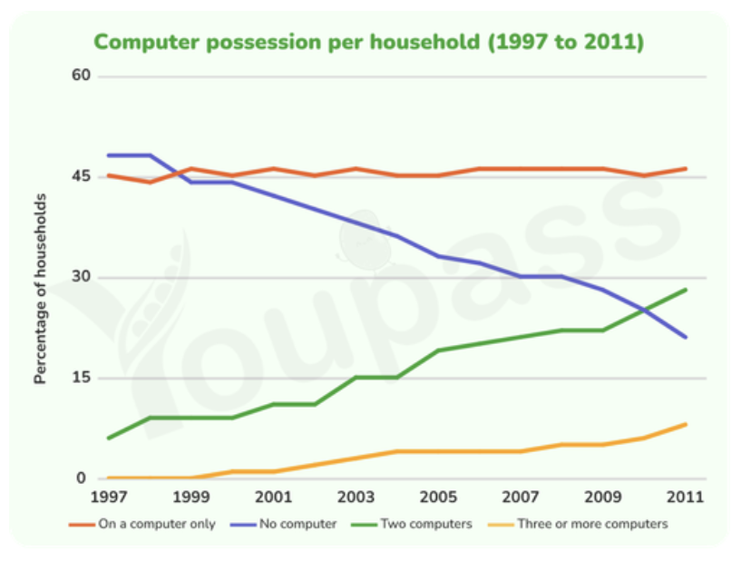
The line graph illustrates the proportion of computer ownership by household in one European country from 1997 to 2011. It is clear that having only one computer is the most popular trend from the late 1990s. Besides that, there was an increase in the percentage of households having two computers and three or more computers. While, the figures for computer-free households experienced a considerable decline. The rate of households owning two computers started at about 7% in 1997, followed by a significant rise to nearly 30% in 2011. A similar change was seen in the figures for three or more computers, which increased by approximately 8% after 14 years. However, it consistently accounted for the smallest proportion of the total. In 1997, over 45% of households didn't have any computers. In the following years, that percentage experienced a dramatic drop to around 21% in 2011. By contrast, the rate of households possessing only one computer remained unchanged at about 45% throughout the period.
Detail Sampel
The graph below gives information about computer possession by household in one European country between 1997 and 2011. Summarise the information by selecting and reporting the main features, and make comparisons where relevant.
22/07/2026 03:17 7.0 skor
Topik
The graph below gives information about computer possession by household in one European country between 1997 and 2011. Summarise the information by selecting and reporting the main features, and make comparisons where relevant.
Jumlah kata: 163
Grafik/Diagram
Essay
Skor Keseluruhan
7.0±0.5
Baik
Skor Kriteria Writing
TA7.0
CC7.0
LR7.0
GRA7.0
Klik teks yang ditandai di esai untuk melihat saran detail untuk peningkatan.
Analisis mendalam
Task 1 - Academic Writing
4 tools available
Esai contoh - IELTS Writing Task 1
Belum ada esai contoh
Silakan klik tombol di bawah untuk menganalisis dan membuat esai contoh berkualitas tinggi untuk Task 1.