
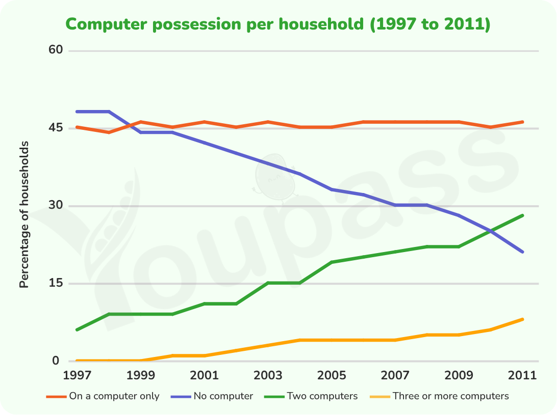
The line graph illustrates computer possession by households in one European country from 1997 to 2011. Overall, it is apparent that households with two computers and three or more computers exhibited an increasing trend throughout the years, while households no computer experienced a considerable decline and households in on a computer only remained stable during the period. In 1997, households with no computer had the highest percentage, starting at over 45% before declining significantly to around 17.5 % at the end of the period. Households with one computer only ranked second which was around 45% in 1997 and had no change over the period. In 1997, households with two computers ranked third in percentage which was around 7.5%. After that, this figure increased considerably to under 30% in 2011. Finally, the proportion of households in three or more computers recorded the lowest level, starting at around 0% and rising slightly to around 7.5% by the end of the period.
รายละเอียดตัวอย่าง
The graph below gives information about computer possession by household in one European country between 1997 and 2011. Summarise the information by selecting and reporting the main features, and make comparisons where relevant.
22/07/2026 03:22 6.0 คะแนน
หัวข้อ
The graph below gives information about computer possession by household in one European country between 1997 and 2011. Summarise the information by selecting and reporting the main features, and make comparisons where relevant.
จำนวนคำ: 159
แผนภูมิ/กราฟ
Essay
คะแนนรวม
6.0±0.5
ดีพอใช้
คะแนนเกณฑ์การเขียน
TA6.0
CC6.0
LR6.0
GRA6.0
คลิกข้อความที่ไฮไลต์ในเรียงความเพื่อดูคำแนะนำรายละเอียดเพื่อพัฒนา
การวิเคราะห์เชิงลึก
Task 1 - Academic Writing
4 tools available
บทความตัวอย่าง - IELTS Writing Task 1
ยังไม่มีบทความตัวอย่าง
กดปุ่มด้านล่างเพื่อวิเคราะห์และสร้างบทความตัวอย่างคุณภาพสูงสำหรับ Task 1