
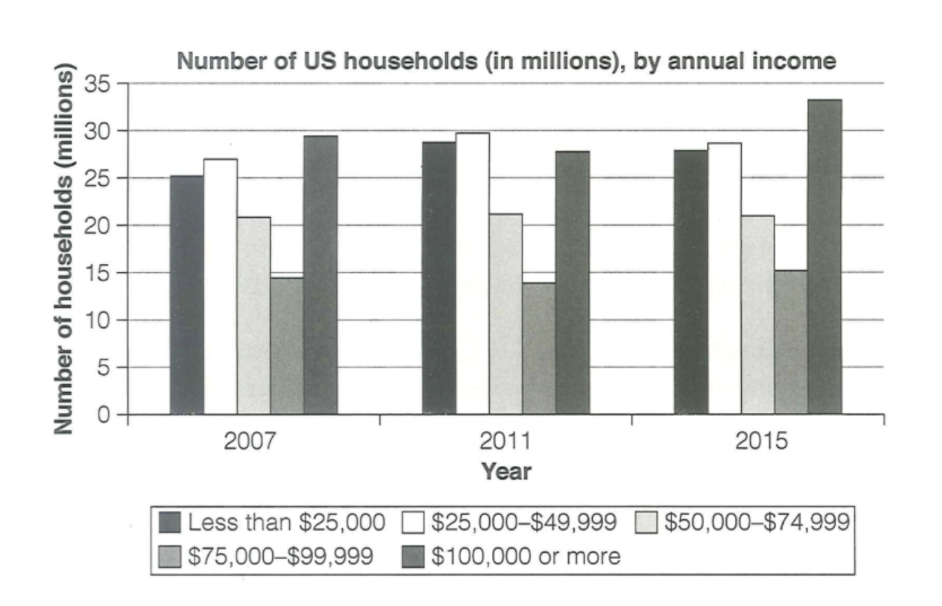
The chart illustrates how many households in the US by their annual income in the years 2007, 2011 and 2015. Overall, the number of households with the income less than $25,000, $25,000 to $49,999, $75,000–$99,999 and $100,000 or more all saw a slight increase. The number of households who had at least $100,000 recorded the largest throughout three years. However, only the figure for those who had $50,000 to $74,999 remained a stable trend. Firstly, the number of households with less than $25,000 income rise minimally from 25 millions in 2007 to 28 millions in 2015. The similar trend was seen in families had $25,000 to $49,999, from 27 millions to 29 million. The figure for those had $75,000–$99,999 also witnessed the smallest increase from 14.5 million to 15 million. Meanwhile, the number of households with at least $100,000 income remained the largest figure, starting at 29.5 millions in 2007 and rose sharply to 33 millions in 2015. In contrast, there was an unchanged trend in the number of those who had $50,000 to $74,999 income. It remained at roughly 21 millions across three years.
Detail Sampel
The chart below shows the number of households in the US by their annual income in 2007, 2011 and 2015.
22/07/2026 03:39 6.0 skor
Topik
The chart below shows the number of households in the US by their annual income in 2007, 2011 and 2015.
Jumlah kata: 185
Grafik/Diagram
Essay
Skor Keseluruhan
6.0±0.5
Cukup
Skor Kriteria Writing
TA6.0
CC6.0
LR6.0
GRA6.0
Klik teks yang ditandai di esai untuk melihat saran detail untuk peningkatan.
Analisis mendalam
Task 1 - Academic Writing
4 tools available
Esai contoh - IELTS Writing Task 1
Belum ada esai contoh
Silakan klik tombol di bawah untuk menganalisis dan membuat esai contoh berkualitas tinggi untuk Task 1.