
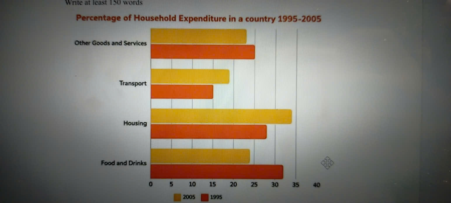
The given bar chart depicts the proportion of household spending on goods and services in a nation between 1995 and 2005. Overall, while the percentage of expenditure allocated to transport and housing experienced an upward trend, the opposite was true for the other two categories. In addition, spending on transport was the lowest during the whole period. In 1995, while Food and Drinks stood in the first place in household spending at 32%, expenditure on Housing was lower, namely 28%. Over the following 10 years, these two categories followed a contrasting pattern, in which Housing reached a peak of 34% to become the leading category, whereas that of Food and Drinks experienced a moderate decline, dropping to approximately 24%. Regarding the remaining sectors, Transport and Other Goods and Services exhibited distinct trends over the decade. Expenditure on Transport, which started at the lowest rate of 15% in 1995, consistently increased and reached approximately 19% by 2005. On the contrary, the percentage of spending on Other Goods and Services saw a slight decrease, from about 25% to 23% over the same period.
Sample Detail
The chart shows the percentage of household expenditure on goods and services in a country from 1995 to 2005. Summarise the information by selecting and reporting the main features and make comparisons where relevant.
22/07/2026 03:46 7.0 points
Topic
The chart shows the percentage of household expenditure on goods and services in a country from 1995 to 2005. Summarise the information by selecting and reporting the main features and make comparisons where relevant.
Word count: 181
Chart/Graph
Essay
Overall Scores
7.0±0.5
Good
Writing Criteria Scores
TA7.0
CC7.0
LR7.0
GRA7.0
Click on any highlighted text in the essay to view detailed suggestions for improvement.
Deep Analysis
Task 1 - Academic Writing
4 tools available
Sample Essay - IELTS Writing Task 1
No sample essay
Click the button below to analyze and generate a high-quality sample essay for Task 1.