
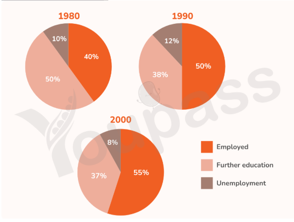
The three pie charts compare the proportion of secondary school leavers in Australia in three different groups: employment, unemployment and further education in 1980, 1990 and 2000 Overall, it is clear that the percentage of students who were employed increased, while the figure for further education group decreased. Meanwhile there was a fluctuation for the figure of unemployment. In addition, the employment became the largest category in both 1990 and 2000. In 1980, half of students pursued further education after secondary graduation, followed by the employment group with 40%. In the next decade, the proportion of employment witnessed an upward trend by 10%. In 2000, more than half of students were employed, at 55%, while only 37% of students pursued higher education. The percentage of students who were unemployed accounted for only 10% in 1980. During the next ten years, this figure rose slightly before experiencing a decline by 2% in 2000 and remained the smallest segment during the period.
รายละเอียดตัวอย่าง
The graphs below show the percentage of secondary school leavers in Australia who were employed, unemployed or who pursued further education in 1980, 1990 and 2000. Summarise the information by selecting and reporting the main points and make comparisons where relevant.
22/07/2026 04:32 7.0 คะแนน
หัวข้อ
The graphs below show the percentage of secondary school leavers in Australia who were employed, unemployed or who pursued further education in 1980, 1990 and 2000. Summarise the information by selecting and reporting the main points and make comparisons where relevant.
จำนวนคำ: 160
แผนภูมิ/กราฟ
Essay
คะแนนรวม
7.0±0.5
ดีมาก
คะแนนเกณฑ์การเขียน
TA7.0
CC7.0
LR7.0
GRA7.0
คลิกข้อความที่ไฮไลต์ในเรียงความเพื่อดูคำแนะนำรายละเอียดเพื่อพัฒนา
การวิเคราะห์เชิงลึก
Task 1 - Academic Writing
4 tools available
บทความตัวอย่าง - IELTS Writing Task 1
ยังไม่มีบทความตัวอย่าง
กดปุ่มด้านล่างเพื่อวิเคราะห์และสร้างบทความตัวอย่างคุณภาพสูงสำหรับ Task 1