
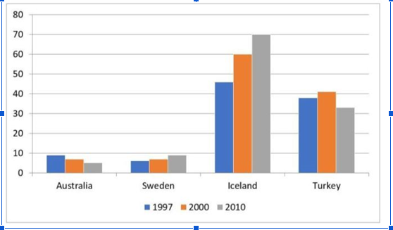
The bar chart illustrates the percentage of alternative power in total energy provision in four distinct nations over a 14-year period spanning from 1997 to 2010. In general, it is evident that the renewable energy rate in Sweden and Iceland followed an upward trend during the timescale in question, while that of Turkey and Australia showed a reverse pattern. Notably, Iceland consistently recorded the highest level throughout. Regarding countries documenting an upswing, there was a remarkable growth in the contribution of power from renewable sources in Iceland, from roughly 45 percent to 70 percent. A similar pattern was observed in that of Sweden, but to a lesser extent, from approximately five percent to shy of ten percent. Turning to nations with a downward trend, alternative energy in Australia accounted for nearly one-tenth of the total power supply, which then progressively declined to around five percent at the end of the period. Furthermore, the share of this energy source in Turkey was about 38 percent, witnessing a marginal rise to more or less 40 percent before reducing to roughly 32 percent by the end of the time frame.
Sample Detail
The chart shows the proportion of renewable energy in total energy supply in 4 countries from 1997 to 2010. Summarise the information by selecting and reporting the main features, and make comparisons where relevant.
22/07/2026 06:03 7.5 points
Topic
The chart shows the proportion of renewable energy in total energy supply in 4 countries from 1997 to 2010. Summarise the information by selecting and reporting the main features, and make comparisons where relevant.
Word count: 187
Chart/Graph
Essay
Overall Scores
7.5±0.5
Good
Writing Criteria Scores
TA8.0
CC8.0
LR7.0
GRA8.0
Click on any highlighted text in the essay to view detailed suggestions for improvement.
Deep Analysis
Task 1 - Academic Writing
4 tools available
Sample Essay - IELTS Writing Task 1
No sample essay
Click the button below to analyze and generate a high-quality sample essay for Task 1.