
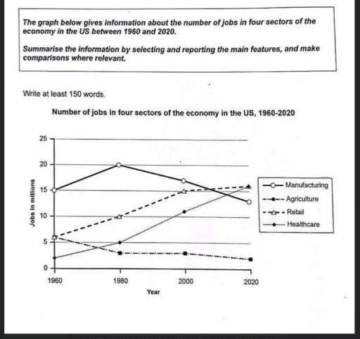
The line graph illustrates the number of employees in four sectors of the economy in the US between 1960 and 2020. Overall, the number of retail and healthcare workers increased, albeit at varying rates, while the reverse was true for manufacturing and agriculture. However, the number of manufacturing workers stood out among the other categories with consistently higher figures. Focusing on the increases first, the number of retail jobs started at about 6 million in 1960. Over the six decades, it experienced a significant increase from 6 million in 1960 to 16 million in 2020. Similarly, the number of healthcare jobs grew dramatically from 2 million in 1960 to 16 million in 2020. By contrast, the number of manufacturing and agriculture jobs decreased over the period. The number of manufacturing jobs increased steadily from 15 million in 1960 to 20 million in 1980, but this was followed by a significant decrease to 13 million in the final year. The number of agriculture jobs declined gradually from 5 million in 1960 to about 2 million in 2020.
รายละเอียดตัวอย่าง
The graph below gives information about the number of jobs in four sectors of the economy in the US between 1960 and 2020.
22/07/2026 12:07 7.0 คะแนน
หัวข้อ
The graph below gives information about the number of jobs in four sectors of the economy in the US between 1960 and 2020.
จำนวนคำ: 176
แผนภูมิ/กราฟ
Essay
คะแนนรวม
7.0±0.5
ดีมาก
คะแนนเกณฑ์การเขียน
TA7.0
CC7.0
LR7.0
GRA8.0
คลิกข้อความที่ไฮไลต์ในเรียงความเพื่อดูคำแนะนำรายละเอียดเพื่อพัฒนา
การวิเคราะห์เชิงลึก
Task 1 - Academic Writing
4 tools available
บทความตัวอย่าง - IELTS Writing Task 1
ยังไม่มีบทความตัวอย่าง
กดปุ่มด้านล่างเพื่อวิเคราะห์และสร้างบทความตัวอย่างคุณภาพสูงสำหรับ Task 1