
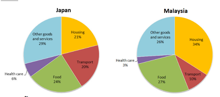
The pie charts illustrate the average amount of money allocated to five specific sectors of household in Japan and Malaysia in 2010. It is clearly seen that Japan is superior in transport and other goods and services, while Malaysia prevails in health care and food. Furthermore, Japan was specialised in other goods and services, while health care was the most substantial household in Malaysia.Looking at the data concerning average household expenses in Japan in detail, other goods and services lead the category at 29%, followed by food, which stood at 24%.Relatively a small proportion of outlay was used for housing and transportation purposes, which constituted 20% and 21% , respectively, whereas healthcare made up only a small share and accounted for 6%. Conversely, when examining the figures regarding household costs in Malaysia, housing tops the category with 34%, followed by food which comprised 27%. Other goods and services and transport were comparatively less significant categories,which amounted to 26% and 10%,accordingly . However, health care was the expenditure, which required the least sum of money and formed just 3%.
รายละเอียดตัวอย่าง
The pie charts below show the average household expenditures in Japan and Malaysia in the year 2010. Summarise the information by selecting and reporting the main features, and make comparisons where relevant.
22/07/2026 12:51 6.0 คะแนน
หัวข้อ
The pie charts below show the average household expenditures in Japan and Malaysia in the year 2010. Summarise the information by selecting and reporting the main features, and make comparisons where relevant.
จำนวนคำ: 178
แผนภูมิ/กราฟ
Essay
คะแนนรวม
6.0±0.5
ดีพอใช้
คะแนนเกณฑ์การเขียน
TA6.0
CC7.0
LR6.0
GRA6.0
คลิกข้อความที่ไฮไลต์ในเรียงความเพื่อดูคำแนะนำรายละเอียดเพื่อพัฒนา
การวิเคราะห์เชิงลึก
Task 1 - Academic Writing
4 tools available
บทความตัวอย่าง - IELTS Writing Task 1
ยังไม่มีบทความตัวอย่าง
กดปุ่มด้านล่างเพื่อวิเคราะห์และสร้างบทความตัวอย่างคุณภาพสูงสำหรับ Task 1