
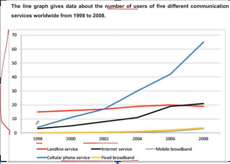
The line graph depicts how five distinct communication services worldwide are used over a period of decade, from 1998 to 2008. Overall, it is obvious that there was an increase in the proportion of several communication service users, with cellular enjoying the most dramatic growth to become the most consumed from 2005 onwards. To start with, the number of people using cellular phone service experienced a gradual rise in the first 4 years, from just 5 to roughly 18 people, and then it continued to substantially grow to approximately 66 people by 2008. Similar changes, but to a lesser extent, can be seen in the figure of internet services, which witnessed a steady increase to just over 10 people in 2004, before it leveled off to a north of 20 people at the end of the period. Regarding the remaining categories, starting with shy of 18 people, the data of landline service soared slightly until 2006 after that the figure decreased to nearly 20 people at the end of time. There was a similar pattern between fixed broadband and mobile broadband number, when they started in 2002 before seeing a slight increase to 2008 with roughly 5 people.
Sample Detail
The line graph gives data about the number of users of five different communication services worldwide from 1998 to 2008.
22/07/2026 12:57 6.5 points
Topic
The line graph gives data about the number of users of five different communication services worldwide from 1998 to 2008.
Word count: 198
Chart/Graph
Essay
Overall Scores
6.5±0.5
Fair
Writing Criteria Scores
TA7.0
CC7.0
LR6.0
GRA6.0
Click on any highlighted text in the essay to view detailed suggestions for improvement.
Deep Analysis
Task 1 - Academic Writing
4 tools available
Sample Essay - IELTS Writing Task 1
No sample essay
Click the button below to analyze and generate a high-quality sample essay for Task 1.