
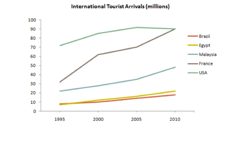
The given line graph illustrates how many international tourist arrivals in five countries, namely Brazil, Egypt, Malaysia, France and USA over a 15-year period, ending in 2010. Overall, it is apparent that all countries witnessed an ascending trend. In addition, by far the most common destination was USA, followed by France. At start of the period, USA was the first-ranking, with 70 million tourists, doubled the figure for France, with 30 million. The number of people travelling to Malaysia was 20 million, which surpassed the figures for Egypt and Brazil, both of which were 10 million visitors. Thereafter, although USA increased gradually to a peak at 90 million tourists in 2005, it experienced a slight decline at the end of this period. Following this is that, France witnessed a considerable growth throughout this period and then reached a peak at 90 million tourists in 2005. Malaysia, Egypt and Brazil were the three lower-ranking and followed simmilar pattern, at 50, 20 and 15 million arrivals respectively in 2010.
Detail Sampel
The graph below gives information about international tourist arrivals in five countries.
22/07/2026 13:35 6.0 skor
Topik
The graph below gives information about international tourist arrivals in five countries.
Jumlah kata: 167
Grafik/Diagram
Essay
Skor Keseluruhan
6.0±0.5
Cukup
Skor Kriteria Writing
TA6.0
CC6.0
LR6.0
GRA6.0
Klik teks yang ditandai di esai untuk melihat saran detail untuk peningkatan.
Analisis mendalam
Task 1 - Academic Writing
4 tools available
Esai contoh - IELTS Writing Task 1
Belum ada esai contoh
Silakan klik tombol di bawah untuk menganalisis dan membuat esai contoh berkualitas tinggi untuk Task 1.