
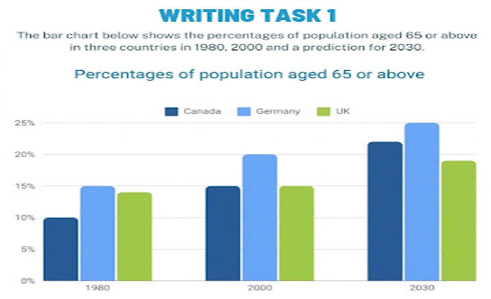
The provided bar chart draws a comparison between the proportion of population aged 65 or over in distinct nations namely Canada, Germany, and the UK in 1980, 2000 including the forecast figures for 2030. Overall, the proportion of elderly individuals is predicted to bloom in different countries. Germany peaks at the highest level over the period, while Canada starts with the lowest figure but finishes with a dramatic growth. In 1980, Germany had the highest proportion at 15%, followed by the UK approximately at 14%. Canada had the lowest figure, started exactly at 10%. Over the period from 1980 to 2000, Germany's figure bloom dramatically to 20%. Additionally, after a moderate up-turn, Canada's proportion reached 15% in 2000. There was a steady trend in the UK between 1980 and 2000, which was followed by a gradual increase in the following years. Looking at the forecast in 2030, Germany is expected to remain the nation peaking the highest proportion of elderly individuals at 25%. Before reaching this figure, its proportion underwent already climbed exactly to 20% in 2000. Canada's rate grew stably, and then bloom sharply to 22% in 2030. By 2030, the UK's figure rose gradually to roughly 20%, remaining lower than those of Germany and Canada.
รายละเอียดตัวอย่าง
The bar chart below shows the percentages of population aged 65 or above in three countries in 1980, 2000 and a prediction for 2030.
22/07/2026 13:45 6.5 คะแนน
หัวข้อ
The bar chart below shows the percentages of population aged 65 or above in three countries in 1980, 2000 and a prediction for 2030.
จำนวนคำ: 207
แผนภูมิ/กราฟ
Essay
คะแนนรวม
6.5±0.5
ดีพอใช้
คะแนนเกณฑ์การเขียน
TA7.0
CC7.0
LR6.0
GRA6.0
คลิกข้อความที่ไฮไลต์ในเรียงความเพื่อดูคำแนะนำรายละเอียดเพื่อพัฒนา
การวิเคราะห์เชิงลึก
Task 1 - Academic Writing
4 tools available
บทความตัวอย่าง - IELTS Writing Task 1
ยังไม่มีบทความตัวอย่าง
กดปุ่มด้านล่างเพื่อวิเคราะห์และสร้างบทความตัวอย่างคุณภาพสูงสำหรับ Task 1