
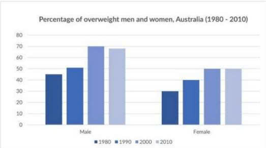
The given bar graph shows how many the proportion of men and women were overweight in Australia over the period of 30 years starting from 1980. Overall, it is apparent that the figure for men overweight significantly rose and made up the most highest category in most of the period, while Female recorded a lower percentage over 30 years. Furthermore, overweight female had only one time to reach the same level as Male in 2000. Look at the chart in more detail, men witnessed an slight upward trend, with its percentage of overweight from about 45% in 1980 to 50% in 1990. During the same time, Female also followed a similar pattern but to a greater extent, rising by 10% from the initial 30% over the 10-year timespan. Turning to the ramaining categories, from 1990 to 2000, there was a surge in the proportion of overweight men, considerably climbing from roughly 50% to about 70%, then suddenly saw a decline to just below 70% by the end of the period. At the same time, the figure for female remarkably increased from 40 in 1990 to 50 in 2000. Thereafter, the figure for overweight female had stayed static at 50% to the end of the period
รายละเอียดตัวอย่าง
The chart gives information about the percentage of overweight men and women in Australian from 1980-2010
22/07/2026 14:14 6.0 คะแนน
หัวข้อ
The chart gives information about the percentage of overweight men and women in Australian from 1980-2010
จำนวนคำ: 205
แผนภูมิ/กราฟ
Essay
คะแนนรวม
6.0±0.5
ดีพอใช้
คะแนนเกณฑ์การเขียน
TA6.0
CC7.0
LR6.0
GRA6.0
คลิกข้อความที่ไฮไลต์ในเรียงความเพื่อดูคำแนะนำรายละเอียดเพื่อพัฒนา
การวิเคราะห์เชิงลึก
Task 1 - Academic Writing
4 tools available
บทความตัวอย่าง - IELTS Writing Task 1
ยังไม่มีบทความตัวอย่าง
กดปุ่มด้านล่างเพื่อวิเคราะห์และสร้างบทความตัวอย่างคุณภาพสูงสำหรับ Task 1