
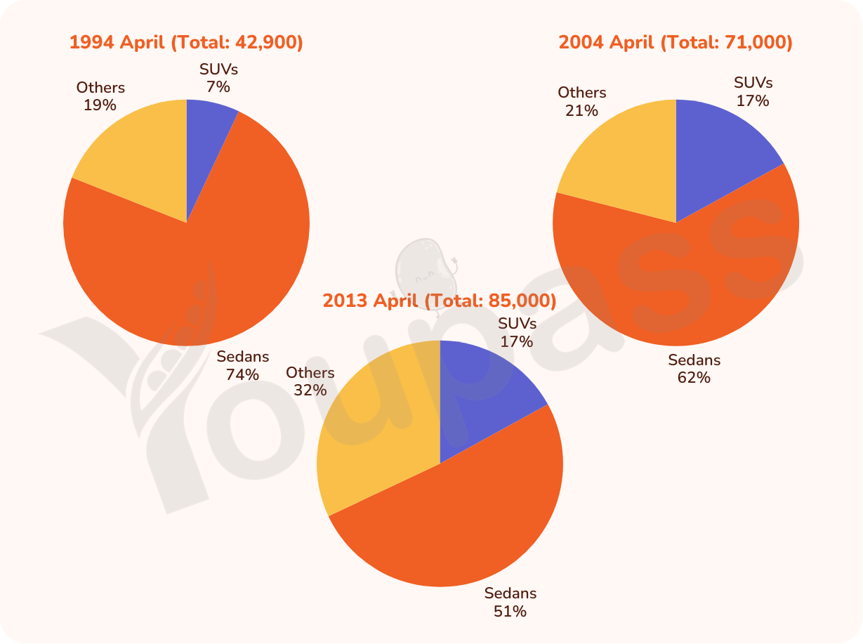
The pie charts illustrates the percentag of new cars in Australia in 3 different years . Overall , there were two percentage of new cars showing upward trending , with sendans reach highest level and it was the most significant increase . Meanwhile , suVs in 3 years was stable between 2004 and 2013 , with 17% of suVs in 2 years . Total of 2013 was highest in 3 years by 85,000% in total of 3 years , in 2013 was total reach highest level by 85,000 and then 2004 and 1994 , at 71,000 and 42,9000 , respectively . In reducing of new cars in 3 years , there were others and suVs . Also it was sligh growth but it was developing in 3 years . In others , it was from 19% to 32% , growth near 11% . Meanwile , suVs wasstable in 1994 , 2004 and 2013 By contrast , sedans was a significant decrease , between 74% and 51% , it was so large . In 1994 , it was the highest in 3 types of new cars with 74% , it occupy large percentage in 3 types . MEanwhile , after years it was significant decreasing
Detail Sampel
The pie charts show the sales of new cars in Australia in 1994, 2004, and 2013. Summarize the information by selecting and reporting the main points and make comparisons where relevant.
22/07/2026 14:14 5.0 skor
Topik
The pie charts show the sales of new cars in Australia in 1994, 2004, and 2013. Summarize the information by selecting and reporting the main points and make comparisons where relevant.
Jumlah kata: 204
Grafik/Diagram
Essay
Skor Keseluruhan
5.0±0.5
Dasar
Skor Kriteria Writing
TA6.0
CC5.0
LR5.0
GRA5.0
Klik teks yang ditandai di esai untuk melihat saran detail untuk peningkatan.
Analisis mendalam
Task 1 - Academic Writing
4 tools available
Esai contoh - IELTS Writing Task 1
Belum ada esai contoh
Silakan klik tombol di bawah untuk menganalisis dan membuat esai contoh berkualitas tinggi untuk Task 1.