
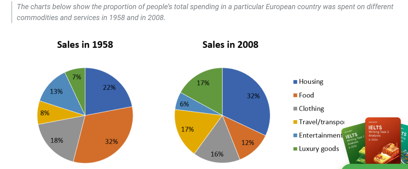
The given two charts illustrate the figure for European's total spending on different commodities and services between 1958 and 2008. Overall,it can be seen that while the percentage of Housing and Food accounted for the highest figures,the oppsite was true for the rate of Luxury goods and Entertainment. Looking at the first chart,The figure for Food contributed the highest percentage,at 32% and the proportion of Housing stood at the second place with significantly lower number,at 22% which was 4% higher than the rate of Clothing and 9% higher than the figure for Entertainment.The percentage of Travel/Transport and Luxury goods had approximately the same figure,at 8% and 7% ,respectively. Regarding the second chart,the smallest number belonged to the figure for Entertainment with 6%..This is followed by the proportion of the Food with a double higher proportion,with 12% which was 4% lower than the pecentage of Clothing.The percentage of Travel/Transport and Luxury goods had the same figure,at 17%.On the other hand,The figure of Housing occupied the largest date,with 32%.
Sample Detail
The charts below show the proportion of people’s total spending in a particular European country was spent on different commodities and services in 1958 and in 2008.
22/07/2026 14:17 5.5 points
Topic
The charts below show the proportion of people’s total spending in a particular European country was spent on different commodities and services in 1958 and in 2008.
Word count: 167
Chart/Graph
Essay
Overall Scores
5.5±0.5
Basic
Writing Criteria Scores
TA6.0
CC7.0
LR5.0
GRA5.0
Click on any highlighted text in the essay to view detailed suggestions for improvement.
Deep Analysis
Task 1 - Academic Writing
4 tools available
Sample Essay - IELTS Writing Task 1
No sample essay
Click the button below to analyze and generate a high-quality sample essay for Task 1.