
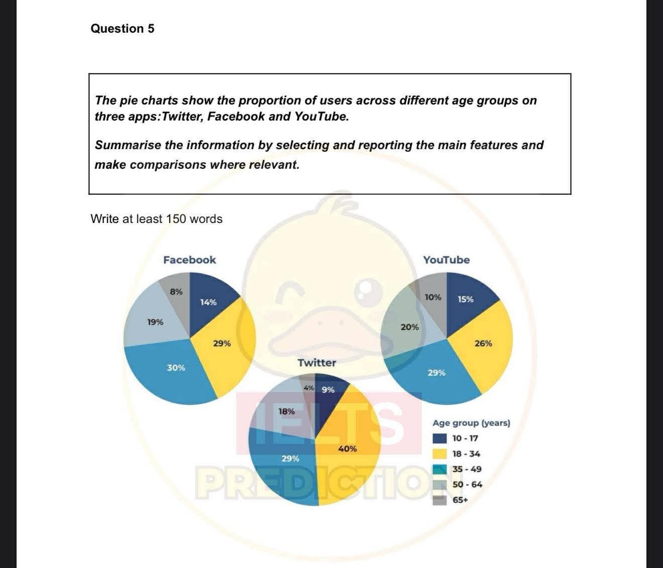
The pie charts illustrate the percentage of users in different age groups who use three applications including Twitter,Facebook and Youtube. Overall, it is clear that people aged 18–34 and 35–49 accounted for the largest proportions of users on all three applications,while those aged 50 and over accounted for the smallest figure.In addition, the oldest age group was consistently the least common across all three apps Regarding Facebook’s figure, the share of facebook users aged 35 to 49 recorded the highest,at 30% and the figure for the 18-34 age group was lower, at 29%. Meanwhile, 19% was the percentage of people who were 50-64 using facebook,compared to 14% of those aged 10-17 and 8% of people who were aged 65+. Similarly, on Youtube, the proportion of people aged 35 to 49 took the lion’s share,accounting for 29%, and the figure for people in the age range of 18 to 34 was lower, at 26%.Additionally, the share of people who were aged 50 to 64 (about 20%) was far higher than that of the 10-17 age group and the 65+ age group , which was 15% and 10% respectively. Turning to Twitter, the percentage of people who were in the 18 to 34 age group far exceeded that of the 35-49 age group and the 50-64 age group, with respective figures being 40%, 29% and 18%.By contrast, the figures for the 10–17 and 65+ age groups were much lower, at just 9% and 4%, respectively.
รายละเอียดตัวอย่าง
the pie charts show the proportion of users across different age groups on three apps :twitter, facebook and youtube
22/07/2026 14:24 6.5 คะแนน
หัวข้อ
the pie charts show the proportion of users across different age groups on three apps :twitter, facebook and youtube
จำนวนคำ: 243
แผนภูมิ/กราฟ
Essay
คะแนนรวม
6.5±0.5
ดีพอใช้
คะแนนเกณฑ์การเขียน
TA7.0
CC7.0
LR7.0
GRA6.0
คลิกข้อความที่ไฮไลต์ในเรียงความเพื่อดูคำแนะนำรายละเอียดเพื่อพัฒนา
การวิเคราะห์เชิงลึก
Task 1 - Academic Writing
4 tools available
บทความตัวอย่าง - IELTS Writing Task 1
ยังไม่มีบทความตัวอย่าง
กดปุ่มด้านล่างเพื่อวิเคราะห์และสร้างบทความตัวอย่างคุณภาพสูงสำหรับ Task 1