
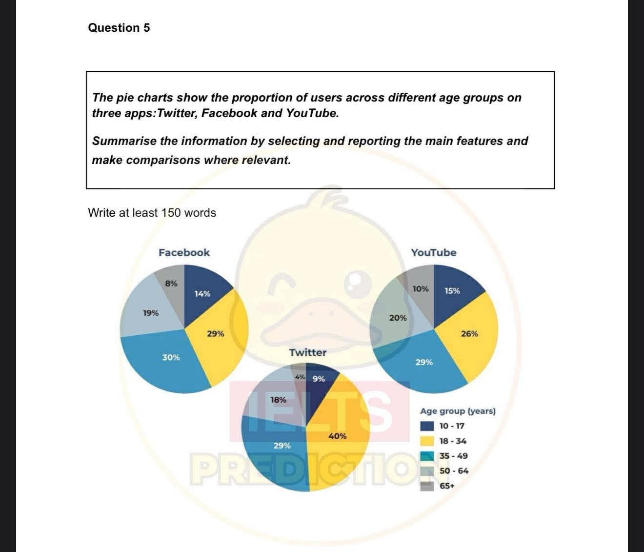
The pie chart illustrates the share of individuals who use social media in different age groups on three apps: Youtube, Twitter, Facebook. Overall, the percentages of social media users between the 10 to 49 age groups made up the largest proportion of users on all platforms. In contrast, the oldest group recorded the lowest figure. Regarding Facebook’s figure, the share of Fb users aged 35 to 49 recorded the highest at 30% and the figure for the 18 to 34 age group was lower at 29%. Meanwhile, 19% was the percentage of people who were 50 to 64 using FB,compared to 14% those aged 10-17 and 8% of the 65+ group. Concerning Twitter’s figures, it took the lion’s share, accounting for 40% of people falling into the 18 to 34 age group and the rank second with 29% of the 35-49s. Additionally,the figure for users aged 50 to 64 was at around 18% using Twitter, compared to 9% of those aged 10 to 17 and 4% of the 65+ group. Looking at the figures more closely, the percentage of Youtube users aged 35 to 49 recorded the peak at 29% and the figure for the 18 to 34 age group was lower at 26%. Meanwhile, 20% was the percentage of the people who were 50 to 64s using YT,compared to 15% those aged 10-17 and 10% of the 65+ group.
Detail Sampel
the pie charts show the proportion of the users across different age group on the 3 apps : twitter, fb and youtube
22/07/2026 14:48 6.5 skor
Topik
the pie charts show the proportion of the users across different age group on the 3 apps : twitter, fb and youtube
Jumlah kata: 230
Grafik/Diagram
Essay
Skor Keseluruhan
6.5±0.5
Cukup
Skor Kriteria Writing
TA7.0
CC7.0
LR6.0
GRA6.0
Klik teks yang ditandai di esai untuk melihat saran detail untuk peningkatan.
Analisis mendalam
Task 1 - Academic Writing
4 tools available
Esai contoh - IELTS Writing Task 1
Belum ada esai contoh
Silakan klik tombol di bawah untuk menganalisis dan membuat esai contoh berkualitas tinggi untuk Task 1.