
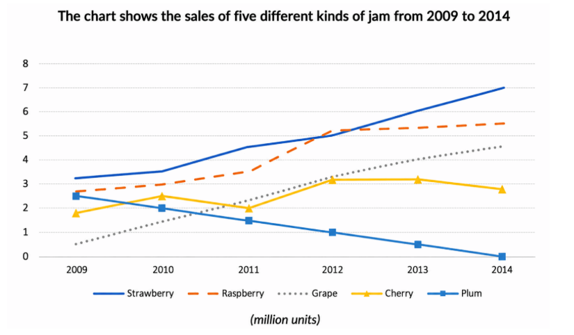
The line graph indicates the sales of strawberry, raspberry, grape, cherry and plum between 2009 and 2014. Overall, while strawberry, raspberry and grape increased significantly, that of plum showed a downward trend. In addition, there was a fluctuation in the sales of cherry and strawberry had the highest sales of five different kinds at the beginning of the period. At the end, plum remained the lowest sales of five different kinds. Looking at the details, the strawberry experienced a remarkable rise over the 5 years. In 2009, the strawberry remained the largest sales of five different kinds at around 3.7 and rose significantly from 3.5 in 2010 to 7 in 2014. The grape was the lowest in 2009 at around 0.5 and increased remarkably between 1.5 in 2010 and 4.5 in 2014. The raspberry started at 2.7, and then it rose considerably and unchanged at increased marginally from 5.1 in 2012 to 5.5 in 2014. In contrast, the plum showed a downward trend over the 5 years. It decreased steadily to reach its lowest point from 2.5 in 2009 to 0 in 2014. The cherry started at 1.9, then it increased slightly to 2.5 in 2010. However, it fell marginally to 2 in 2011. But the figure increased significantly and then decreased slightly.
Sample Detail
The chart shows the sales of five different kinds of jam from 2009 to 2014.
22/07/2026 17:37 6.0 points
Topic
The chart shows the sales of five different kinds of jam from 2009 to 2014.
Word count: 213
Chart/Graph
Essay
Overall Scores
6.0±0.5
Fair
Writing Criteria Scores
TA6.0
CC7.0
LR6.0
GRA6.0
Click on any highlighted text in the essay to view detailed suggestions for improvement.
Deep Analysis
Task 1 - Academic Writing
4 tools available
Sample Essay - IELTS Writing Task 1
No sample essay
Click the button below to analyze and generate a high-quality sample essay for Task 1.