
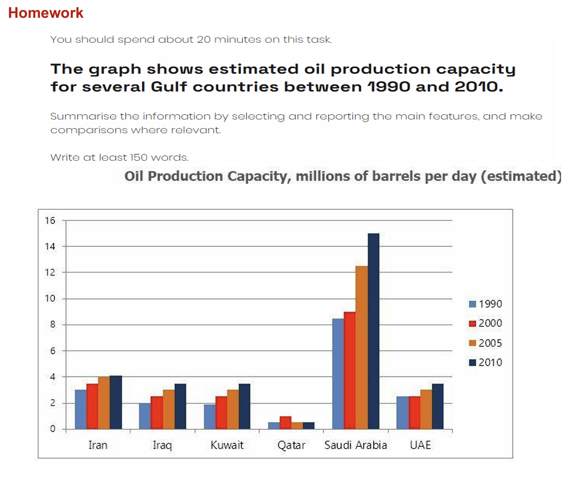
The displayed figure depicts data about fuel production capacity for various Gulf nations from 1990 to 2010 the results are counted in millions . Overall, it is evident that the most noticeable increase was in the rate regarding Saudi Arabia which clearly surpassed all other points by a substantial margin. However, Qatar remained the lowest throughout the given period. Moving to details , in 1990 Saudi Arabia had a massive increase about 15 million and gradually changed over the upcoming three years dropped around 8.5 million . While Qatar steady constant from 1990 to 2010 and witnessed a steady increase in 2000 by 1.5 million .In addition, Iran in 1990 approximately rated 2.5 million and gently grew to 3.5 million in 2000 whereas in 2005 and 2010 flattened out at 4 million . Conversely, Kuwait and Iraq between 1990 and 2010 reached plateau same as UAE in the year 1990 and 2010 steady relatively stable 2 million .In 2005 slightly increased to 3 million then in 2010 showed an upward trend inclined to 3.5 million . Interestingly , Qatar pointed a constant average of petrol productions in 1990 and 2010 .
รายละเอียดตัวอย่าง
The graph shows estimated oil production capacity for several Gulf countries between 1990 and 2010. Summarise the information by selecting and reporting the main features, and make comparisons where relevant.
22/07/2026 21:35 5.0 คะแนน
หัวข้อ
The graph shows estimated oil production capacity for several Gulf countries between 1990 and 2010. Summarise the information by selecting and reporting the main features, and make comparisons where relevant.
จำนวนคำ: 191
แผนภูมิ/กราฟ
Essay
คะแนนรวม
5.0±0.5
พื้นฐาน
คะแนนเกณฑ์การเขียน
TA5.0
CC5.0
LR5.0
GRA5.0
คลิกข้อความที่ไฮไลต์ในเรียงความเพื่อดูคำแนะนำรายละเอียดเพื่อพัฒนา
การวิเคราะห์เชิงลึก
Task 1 - Academic Writing
4 tools available
บทความตัวอย่าง - IELTS Writing Task 1
ยังไม่มีบทความตัวอย่าง
กดปุ่มด้านล่างเพื่อวิเคราะห์และสร้างบทความตัวอย่างคุณภาพสูงสำหรับ Task 1