
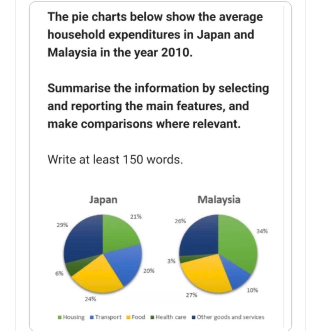
The given pie charts demonstrate the proportion of expenditures which are allocated to various purposes in Japan and Malaysia. The most outstanding feature is that other goods and services emerged as the most prominent of Japan populations, while housing secured the highest figure in Malaysia. With regards to the number of purposes devoted to Japan expenditures, notably, other goods and services ranked first, occupying 29% and far surpassing others. This was closely followed by housing, with figure registering at 21%. The lowest data can be seen in health care, which accounted for just 6%, significantly less than the remaining purposes. Shifting focus to the expenditures of Malaysia populations, apparently, it showcased a similar pattern. One marked disparity was evident in housing as the rate constituted 13% higher than that at Japan residents. Similarly, food outnumbered that of Japan expenditures, with gap being 3%. In contrast, transport and health care were less prominent, exhibiting minimal shares of only one-tenth and 3%, compared to one-fifth and 6% of Japan expenditures.
Sample Detail
Summarise the information by selecting and reporting the main features, and make comparisons where relevant.
23/07/2026 08:15 6.5 points
Topic
Summarise the information by selecting and reporting the main features, and make comparisons where relevant.
Word count: 168
Chart/Graph
Essay
Overall Scores
6.5±0.5
Fair
Writing Criteria Scores
TA7.0
CC7.0
LR6.0
GRA6.0
Click on any highlighted text in the essay to view detailed suggestions for improvement.
Deep Analysis
Task 1 - Academic Writing
4 tools available
Sample Essay - IELTS Writing Task 1
No sample essay
Click the button below to analyze and generate a high-quality sample essay for Task 1.