
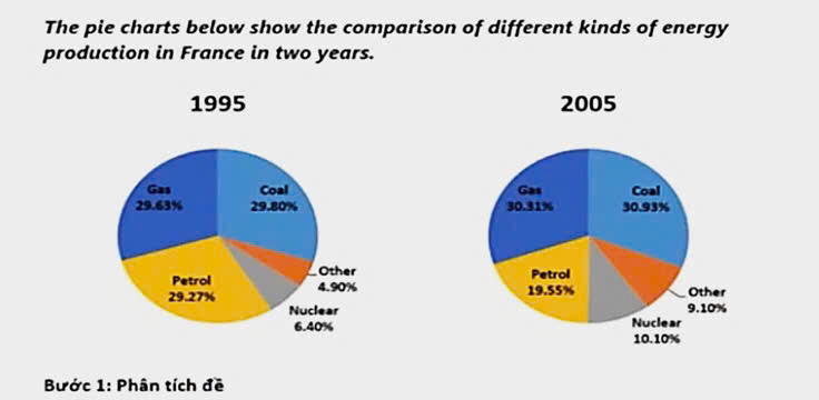
The two pie charts illustrate the percentage of energy produced from five distinct sources in France over a period of 10 years, commencing from 1995. It is clearly seen that the proportions of energy production from gas, coal, other and nuclear power witnessed an upward trend, while the figure for petrol saw a downward tendency. Meanwhile, the one for coal exceeded the others in both year. Looking at the two largest categories, 29.80% was the percentage of energy productions from coal in 1995, before rising to 30.9% in 2005. Similarly, gas increased slightly from 29.63% to 30.31% over the same period. Regarding the others, in 1995, the proportion of energy producted from petrol accounted for 29.27%. However this figure experience a substantial decrease to 19.55% in 2005. Likewise, the percentage of energy production from nuclear upsurge considerable from 6.40% to 10.10% during the 10 year period. The correspondingly figure for other sources also climbed significantly from from 4.90% in 1995 to 9.10% in 2005.
Detail Sampel
the pie charts below show the comparison of differenct kinds of energy productions in france in two years
23/07/2026 08:39 6.5 skor
Topik
the pie charts below show the comparison of differenct kinds of energy productions in france in two years
Jumlah kata: 164
Grafik/Diagram
Essay
Skor Keseluruhan
6.5±0.5
Cukup
Skor Kriteria Writing
TA7.0
CC7.0
LR6.0
GRA6.0
Klik teks yang ditandai di esai untuk melihat saran detail untuk peningkatan.
Analisis mendalam
Task 1 - Academic Writing
4 tools available
Esai contoh - IELTS Writing Task 1
Belum ada esai contoh
Silakan klik tombol di bawah untuk menganalisis dan membuat esai contoh berkualitas tinggi untuk Task 1.