
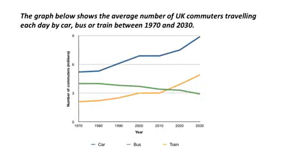
The line graph compares figures for daily travel by people in the UK using three different forms of transport over a period of 60 years. Overall, the car is by far the most popular means of transport for UK commuters during the period shown. Also, the numbers of people who use the car and train increase gradually, while the number of bus users falls steadily. In 1970, around 5 million UK commuters travelled by car on a daily basis, while the bus and train were used by about 4 million and 2 million people respectively. In the year 2000, the number of people driving to work rose to 7 million and the number of commuting rail passengers climbed to 3 million. However, there was a small drop in the number of bus users. By 2030, the number of people who commute by car is expected to increase to almost 9 million, and the number of train users is also predicted to increase, to nearly 5 million. By contrast, buses are likely to become a less popular choice, with only 3 million daily users.
รายละเอียดตัวอย่าง
line graph
23/07/2026 08:44 6.5 คะแนน
หัวข้อ
line graph
จำนวนคำ: 183
แผนภูมิ/กราฟ
Essay
คะแนนรวม
6.5±0.5
ดีพอใช้
คะแนนเกณฑ์การเขียน
TA6.0
CC7.0
LR6.0
GRA7.0
คลิกข้อความที่ไฮไลต์ในเรียงความเพื่อดูคำแนะนำรายละเอียดเพื่อพัฒนา
การวิเคราะห์เชิงลึก
Task 1 - Academic Writing
4 tools available
บทความตัวอย่าง - IELTS Writing Task 1
ยังไม่มีบทความตัวอย่าง
กดปุ่มด้านล่างเพื่อวิเคราะห์และสร้างบทความตัวอย่างคุณภาพสูงสำหรับ Task 1