
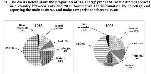
The two pie charts depict the distribution of energy production across six different sources in a country in 1985 and 2003. Overall, the oil share accounted for the largest percentages in both charts despite witnessing a decrease, followed by natural gas and nuclear energy as the top significant contributors. Meanwhile, non-fossil fuel sources generally held the smallest share. In 1985, oil was the principal energy source which remarkably made up 52% of total production. Although its figure experienced a downward trend to only 39% by 2003, the oil share remained dominant. By contrast, the proportion of natural gas saw a significant growth as it nearly doubled and overtook the second rank of nuclear energy which noticeably dropped from 22% to 17%. Concerning the remaining sources, coal and other renewable sources experienced a moderate growth, with the latter quadrupled and the former climbed from 8% to 13% in 2003. Meanwhile, hydrogen remained stable at 4%, meaning that coal’s share was more than three times larger in the final year.
Detail Sampel
The charts below show the proportion of the energy produced from different sources in a country between 1985 and 2003. Summarize the information by selecting and reporting the main features, and make comparisons where relevant.
23/07/2026 09:09 7.0 skor
Topik
The charts below show the proportion of the energy produced from different sources in a country between 1985 and 2003. Summarize the information by selecting and reporting the main features, and make comparisons where relevant.
Jumlah kata: 168
Grafik/Diagram
Essay
Skor Keseluruhan
7.0±0.5
Baik
Skor Kriteria Writing
TA7.0
CC7.0
LR7.0
GRA7.0
Klik teks yang ditandai di esai untuk melihat saran detail untuk peningkatan.
Analisis mendalam
Task 1 - Academic Writing
4 tools available
Esai contoh - IELTS Writing Task 1
Belum ada esai contoh
Silakan klik tombol di bawah untuk menganalisis dan membuat esai contoh berkualitas tinggi untuk Task 1.