
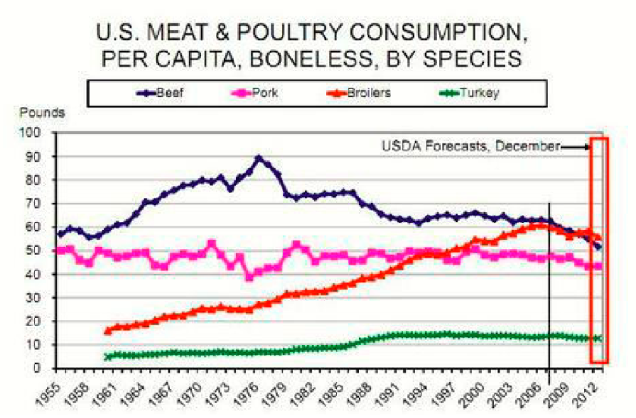
The line graph compare the amount of trends in US meat and poultry consumption between 1955 and 2012. Overall, pork and turkey consumption increased steadily, while broiler showed a sharp rise. By contrast, beef increased gradually before showing a downward trend. From 1955 to 1982, the consumption of pork and beef increased steadily but both figures declined gradually in the following years. Beef consumption reached a peak of 90 pounds in 1976 before falling gradually. Pork consumption rose to 50 pounds and then decreased. Between 1961 and 2012 broiler and turkey increased gradually. Turkey increased constanly from 5 to 15 pound in 1985 and rose gradually by 2012.By contrast broiler increased constantly from 15 to 60 pound in 2009 but it rose slightly from 60 to 55 pound by 2012.
รายละเอียดตัวอย่าง
The graph below shows trends in US meat and poultry consumption.
23/07/2026 09:19 5.0 คะแนน
หัวข้อ
The graph below shows trends in US meat and poultry consumption.
จำนวนคำ: 130
แผนภูมิ/กราฟ
Essay
คะแนนรวม
5.0±0.5
พื้นฐาน
คะแนนเกณฑ์การเขียน
TA5.0
CC5.0
LR5.0
GRA5.0
คลิกข้อความที่ไฮไลต์ในเรียงความเพื่อดูคำแนะนำรายละเอียดเพื่อพัฒนา
การวิเคราะห์เชิงลึก
Task 1 - Academic Writing
4 tools available
บทความตัวอย่าง - IELTS Writing Task 1
ยังไม่มีบทความตัวอย่าง
กดปุ่มด้านล่างเพื่อวิเคราะห์และสร้างบทความตัวอย่างคุณภาพสูงสำหรับ Task 1